From July 2015 to November 2016, I worked as a game designer at Blue Marble Game Co (now called Blue Marble Health). The job was intimidating at first; as the only designer, I was the main creative decision maker at the company. However, everyone on the team worked well together, and we did good work for the past year.
While Blue Marble makes games, their main focus is on providing health-focused measuring and rehabilitation tools. This meant that the projects I worked on had to be scientifically meaningful (in addition to being fun and usable).
While I worked on other minor projects, such as web features and app designs, the 3 major projects I contributed to were:
- July 2015 - July 2016
- Designer
- Made in Unity3D
- Windows Tablet / PC
Overview
Treasure of Bell Island had been in development for the past few years, and had already been released for therapeutic uses. However, I was tasked with designing an updated version, which would incorporate new features that were requested from other members of the team, and be an improvement in fun and usability.
Like Blue Marble's other products, Treasure of Bell Island measures and tests the user's performance. This game in particular is meant to improve the cognitive functions of people who have suffered traumatic brain injury.
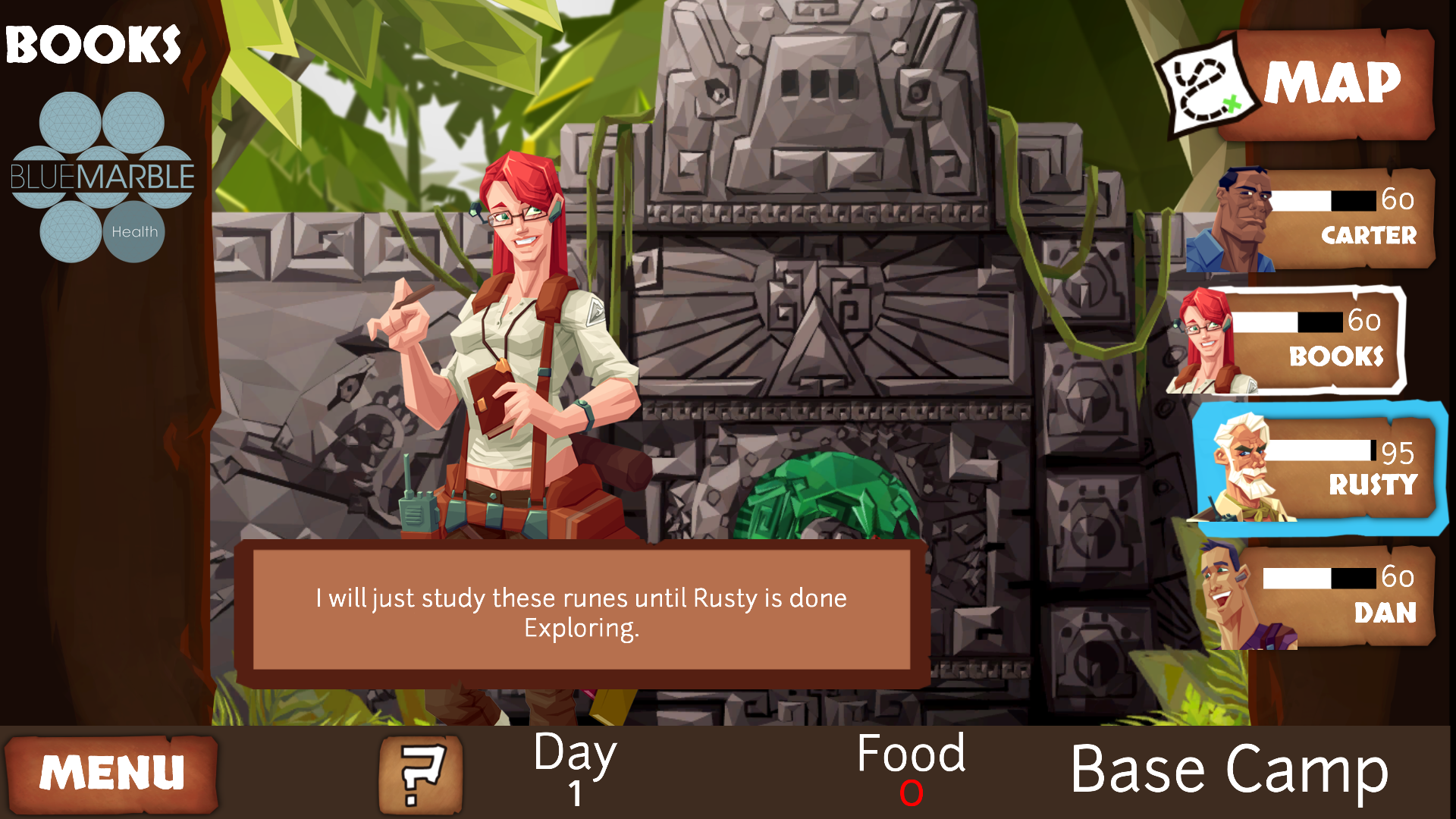
Treasure of Bell Island is a collection of several minigames. Each minigame tests different cognitive abilities. For example, in one minigame the user must drop berries into a moving basket, putting their aiming and timing skills to the test. All the minigames are tied together around a central metagame, starring a team of explorers trapped on a remote island. The player must manage each team member's skills in order to survive and discover the secrets of Bell Island.
Metagame Redesign
One of the main goals of the redesign was to increase the amount of time players spent on the game. To achieve this, I expanded the game's map to almost double the size. Of course, expanding the map wasn't as simple as adding more areas. I adjusted the progression from area to area, making each island a different experience. In addition, I added new features that allowed the player to interact with the various environments in the game, giving the players some optional content to hunt for.

When I conducted playtests with the old version of the game, the largest problem I noticed was with the tutorials in the metagame--players weren't learning how to play the game, and they kept getting stuck. To fix this, I completely reworked all of the tutorials, changing the order that mechanics were introduced and how they were communicated to the player. Along the way, I rewrote the story, expanding the plot and giving the characters more personality.
Minigame Redesigns
While I made minor improvements to all of the minigames, there were two that I felt had to be redesigned completely (based on playtests).

While playtesters all named different minigames as their favorite, one game was NEVER picked as a favorite: Explore. This game tested the player's ability to multitask: with one hand the player must follow a character who is walking on a curvy path; with the other hand the player must tap on oil patches that sprout up randomly. I changed the premise completely: the game became an endless runner, where the player must trace their finger around a twisty path, outrunning a rushing torrent of water. To make things worse, bats would fly in and attack the player if they were not tapped quickly enough. The fact that the player actually controlled the character (instead of just following their preset path), combined with the dangerous premise, resulted in a more fast-paced and exciting game. And, most importantly, I kept the core cognitive measurement (multitasking) intact.
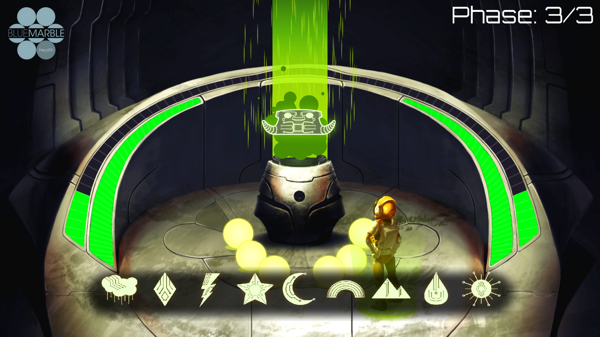
Another minigame, Study, lacked enough challenge to be fun. I redesigned this game to give it more puzzle elements; in the redesigned version, the player must project fragments of light that combine to form a specific symbol.

- July 2015 - October 2016
- Designer
- Made in Unity3D
- Windows Tablet / PC
Overview
Like Treasure of Bell Island, Reset is a collection of minigames which measure the player's cognitive functions. However, Reset is more measurement-focused than fun-focused, and most of the minigames are closer to actual tests than games.
My Tasks
Overall, the changes I made to Reset were much more limited in scope than Treasure of Bell Island. Because the assessments in Reset mirror actual cognitive tests, I was limited in what I could change to avoid contaminating the test results.
Nonetheless, for select assessments, I made whatever design changes I thought were necessary (while keeping the core tests intact). I redesigned UI elements, added more gamelike features and feedback, and improved playability by trimming down the least interesting parts of the assessments. I also redesigned the menus, adding more features to improve usability while expanding how these assessments could be used clinically.
- July 2015 - November 2016
- Designer
- Made in Unity3D
- Windows Tablet / PC
Overview
Health in Motion is an exercise game that is targeted towards seniors. This game is all about preventing falls: the game starts with a test of falls risk, and the exercises are geared towards balance and footwork. In each exercise, a demonstrator shows off the exercise, and the user follows along on their own. The user can create their own custom routine of exercises.
My Tasks
My main task for this project was covering every design aspect of porting this game from Kinect to touchscreen tablet. This involved multiple rewrites to every line of text (for example, adding directions of what to tap for each exercise). In the process, many lines of text were removed or shortened to reduce waiting time for the user.

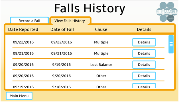
I designed new features for this game, such as the "Record a Fall" menu, where the user can fill in a questionnaire to log any time they've had a fall. I also redesigned several UI elements and menus to improve usability and communication of info, something which is especially important for an older audience.


